


Responsive Website Design
One website that adapts automatically to phones, tablets and desktops — because most of your visitors are checking you out on a phone.
Overview
Your Customers Are Searching For You On Their Phones
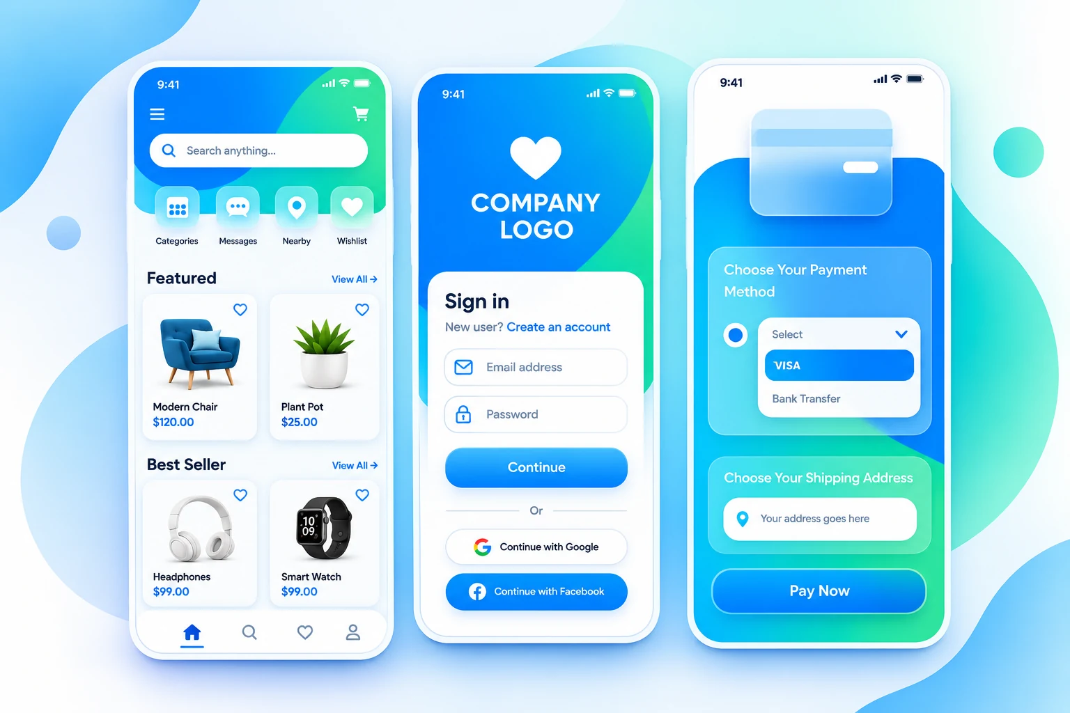
Most website visits today happen on a mobile phone, and Google uses mobile-friendliness as a ranking factor. A responsive website automatically adjusts its layout, images and navigation to fit whichever screen it's viewed on, so you don't need a separate mobile site to maintain.
We design every website at Sparrow Eye to be responsive by default, but if you have an older website that was only built for desktop, we also offer responsive redesigns that rebuild your layout for mobile without starting your whole site over.
What's Included
What's Included in Our Responsive Website Design Service
Every engagement is scoped in writing, so you know exactly what's covered before we start.
- True Mobile-First Design — Layouts designed to work on small screens first, then scaled up — not the other way around.
- Flexible Grids & Images — Content resizes smoothly across phones, tablets, laptops and large desktop screens.
- Touch-Friendly Navigation — Menus and buttons sized and spaced properly for finger taps, not mouse clicks.
- Optimised For Mobile Speed — Compressed images and efficient code so pages load quickly on mobile networks.
- Built For Google's Mobile-First Index — Structured the way Google expects a mobile-friendly site to be structured.
- Tested On Real Devices — We check your site across common phone and tablet sizes before launch, not just in a browser simulator.
Our Process
How We Deliver This
-
1
Discovery Call
We learn about your business, your customers and what you want your website to achieve.
-
2
Design Mockup
Our designers create a visual layout for your approval before any coding begins, so there are no surprises.
-
3
Build & Review
Our developers bring the design to life. You review the working website and request changes.
-
4
Launch & Support
We test on mobile and desktop, take the site live, and stay on for updates and support.
Why Sparrow Eye
Why Businesses Choose Us For This
The same reasons apply whether you're redesigning one page or building a full platform.
One In-House Team
Design, development and marketing sit under one roof at Sparrow Eye, so nothing gets lost between freelancers or agencies — one team is accountable for the result.
Transparent, Written Pricing
You get a fixed quote in writing before any work begins, with no hidden costs added later. You always know what you are paying for.
Support After Launch
Our relationship does not end at go-live. We offer ongoing maintenance, updates and marketing support to keep your website working for you.
FAQ
Frequently Asked Questions
Can't find your answer? Call +91-9250273662 or send us a message.
Is responsive design the same as having a separate mobile website?
No. A responsive website is one single site that adapts to any screen size, which is easier to maintain than running a separate mobile version.
Does Google actually rank mobile-friendly websites higher?
Yes. Google has confirmed mobile-friendliness as a ranking factor, and uses mobile-first indexing, meaning it primarily evaluates the mobile version of your site.
My old website isn't mobile-friendly. Do I need a full rebuild?
Not always. Depending on how it was built, we can sometimes retrofit responsiveness; in other cases a redesign is more practical. We'll review it honestly before quoting.
Will a responsive website cost more?
Responsive design is now our standard for every new website, so it's already included — not an added cost.
Explore More
More in Website Designing


Sparrow Eye is a website designing company in Delhi, India delivering website design, development, digital marketing and hosting — Quality Without Compromise.